George Thomas
Naadan (Local) Brand
How can effective Malayalam-English bilingual branding be created by drawing from historical adaptations of the Malayalam script and contemporary bilingual branding examples?
Project Abstract
From ancient manuscripts painstakingly written on palm leaves to today’s digital screens, Malayalam typography has undergone a rich evolution shaped by the mediums it passed through. Just as Latin serif letters evolved from chiseled stone, Malayalam's rounded and loopy letterforms were developed to avoid tearing palm leaves. Over time, the script adapted to different mediums—paint, print, typewriters, and digital screens.
However, script reforms for digital use simplified many of the letterforms, losing some of their intricacies. Today, as digital typography expands possibilities, we can reintroduce these complexities. My project aims to explore how revived Malayalam typography can foster cultural pride and identity, ensuring that its unique qualities resonate across generations and global contexts. Through design explorations, I hope to celebrate both the heritage and future potential of the Malayalam script.


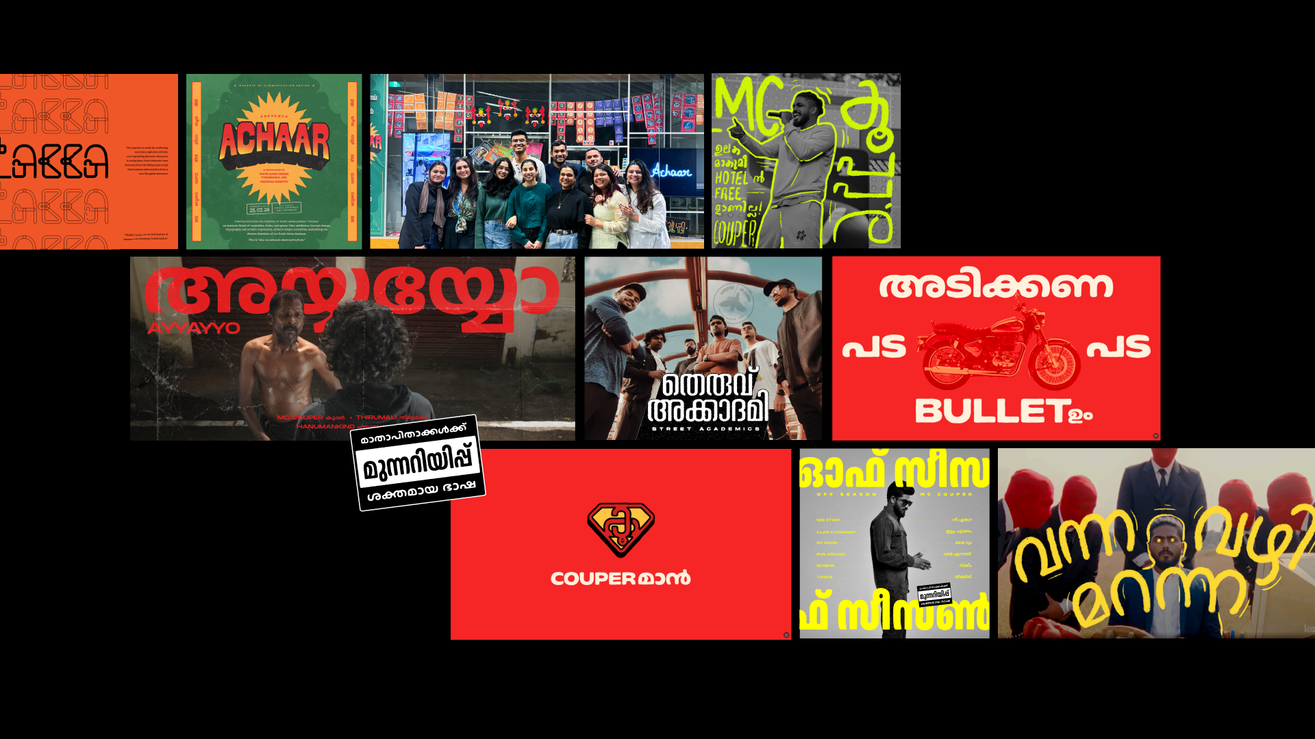
Fig. 1 –
Collage of all work - Explorations of Malayalam Typography and Bilingual branding.

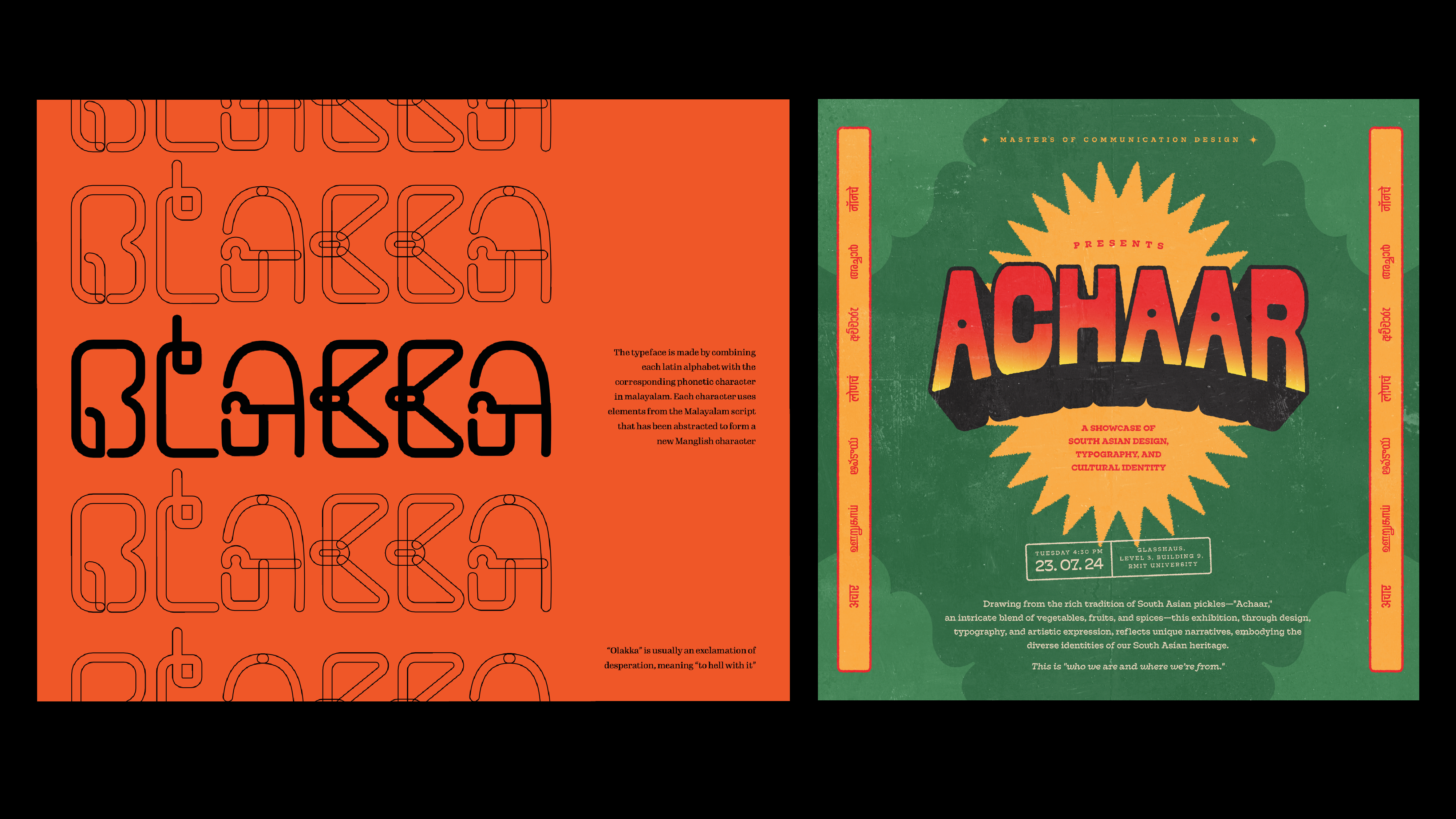
Fig. 2 –
Olakka and Achaar - Taking Malayalam from a local to a global audience.

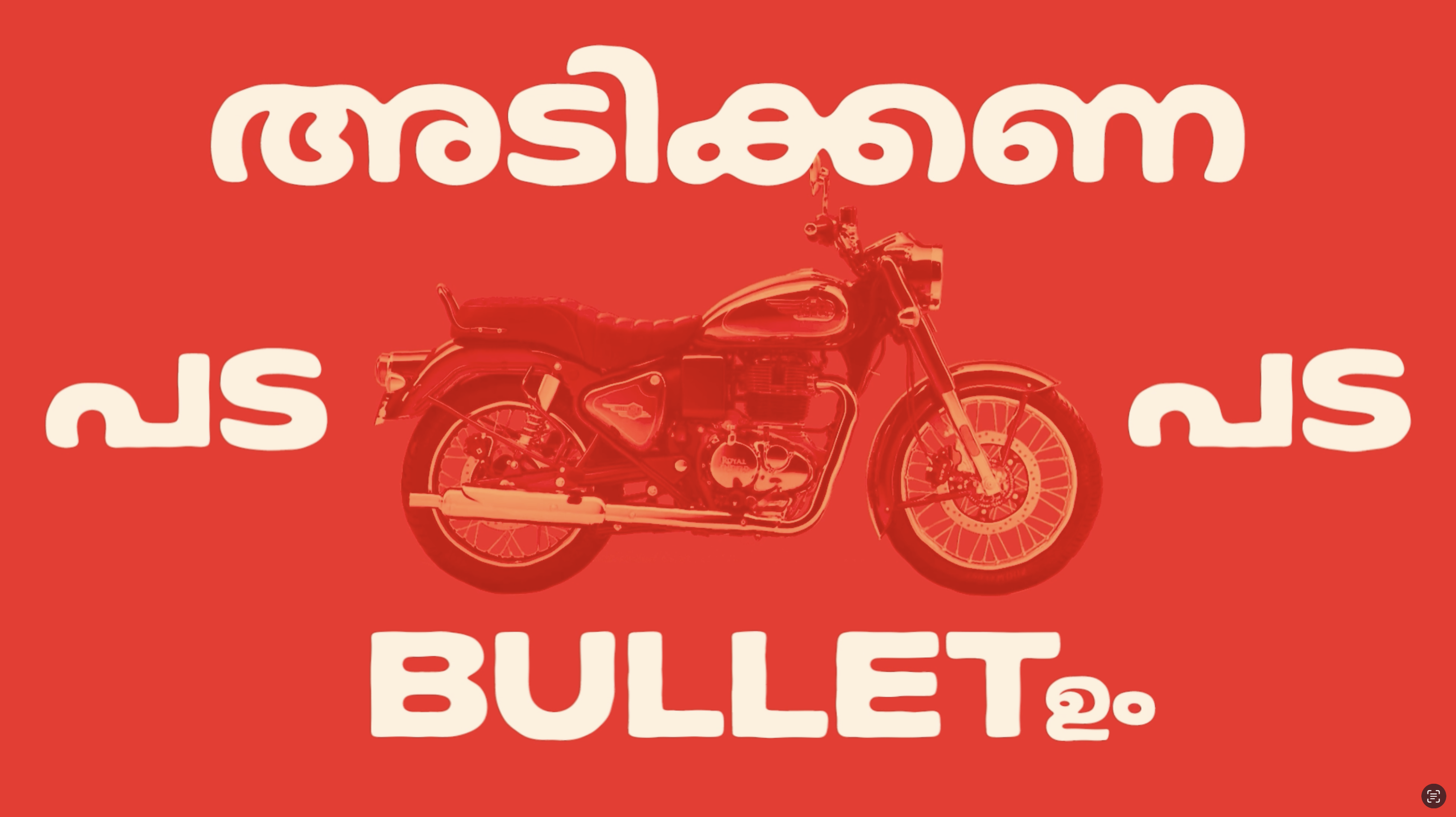
Fig. 3 –
Frame from lyric video for Sharjah Shake by MC Couper mirroring the code-switching between Malayalam and English through typography


