
Shao Shuai
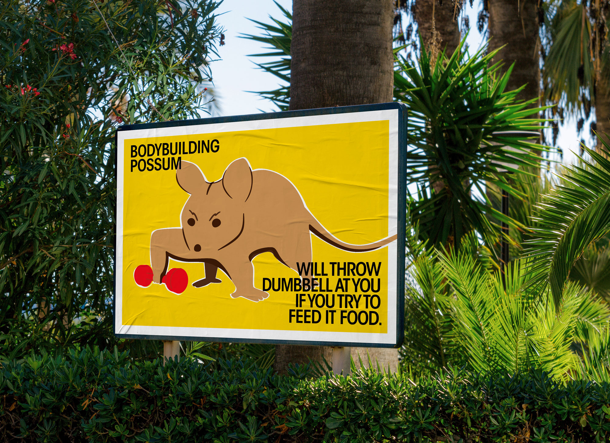
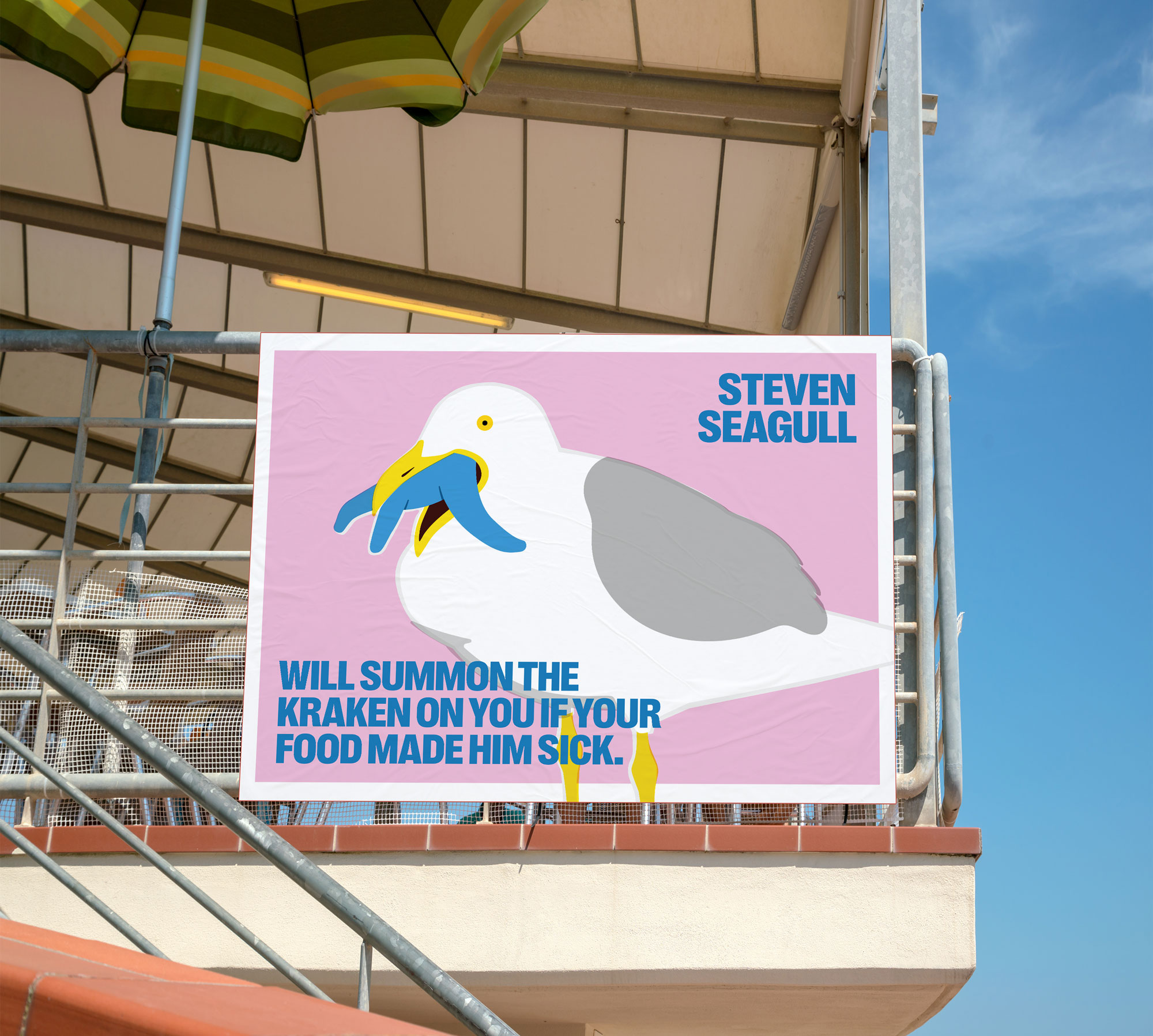
Do Not Feed The Wildlife!
The concept of Cute is nuance yet tangible; many things around us are cute, videos and animations we see are cute. Yet it’s also a vague concept, that cute is what it is for its indeterminacy, its state of ‘becoming’, it’s one thing and many things. This series on poster aimed at the dull, boring warning signages across Melbourne’s parks and gardens. Tthe old signage does not appeal to me as a ‘warning’ with its dull or playful colours. Secondly, their positioning on the ground also contributes to people ignoring it. Furthermore, it’s lazily chained to poles, which psychologically insinuate that whoever set this up does not want to spend time on it.
The overall design aesthetic mimics the misregistration of old printings on matchboxes and stamps. The colours are slightly printed out of place, layered on top of each other, revealing minor parts of the underlying white space. Five designs all have different fonts because they are intended to be installed in different places, and in this case, a consistent typography style won’t be necessary. In contrast, different typography will better match each illustration’s theme, and if someone sees two signages in different locations, they will not feel bored or feel that it’s repetitive. I hope that the animal doing human things illustration with the sarcastic texts will evoke people’s curiosity to read and understand the signage, ultimately following the rule to be a good person.
#Poster #Environment