Extreme Carbon Inequality
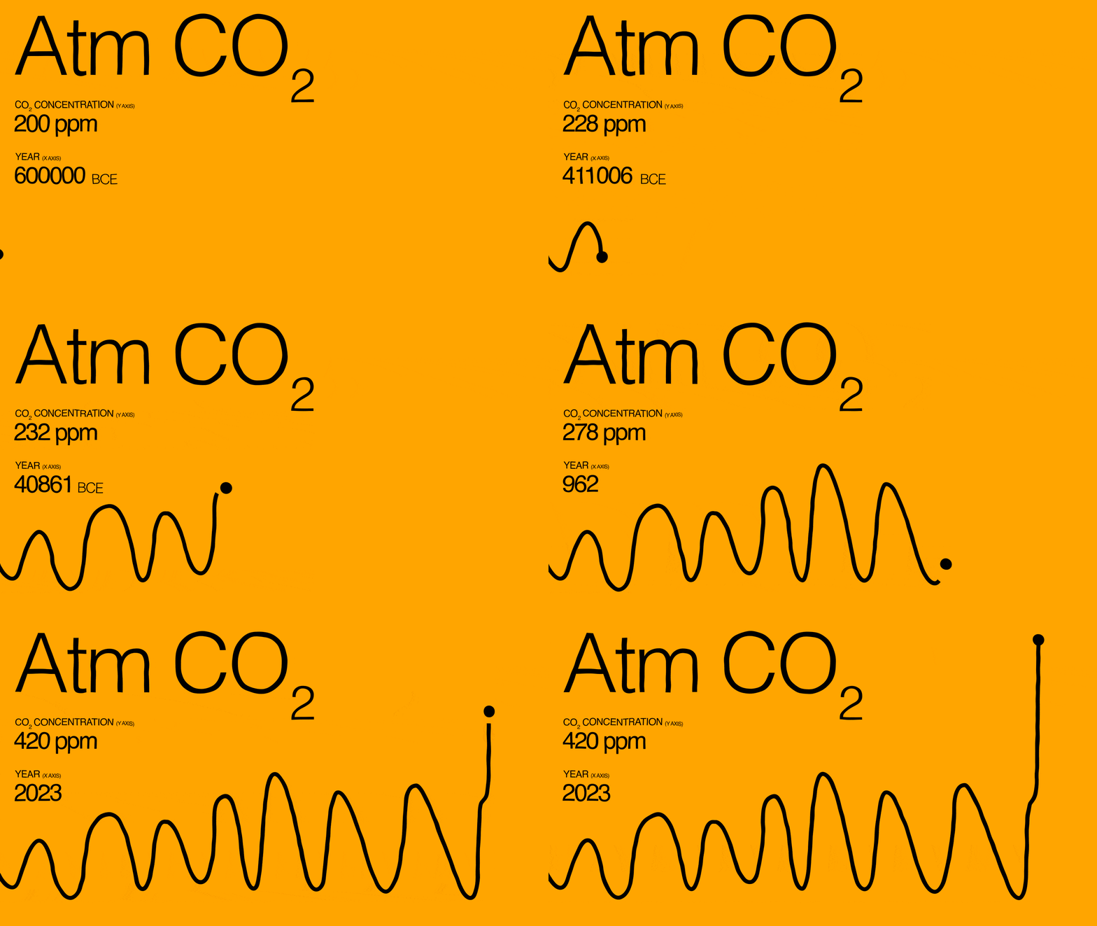
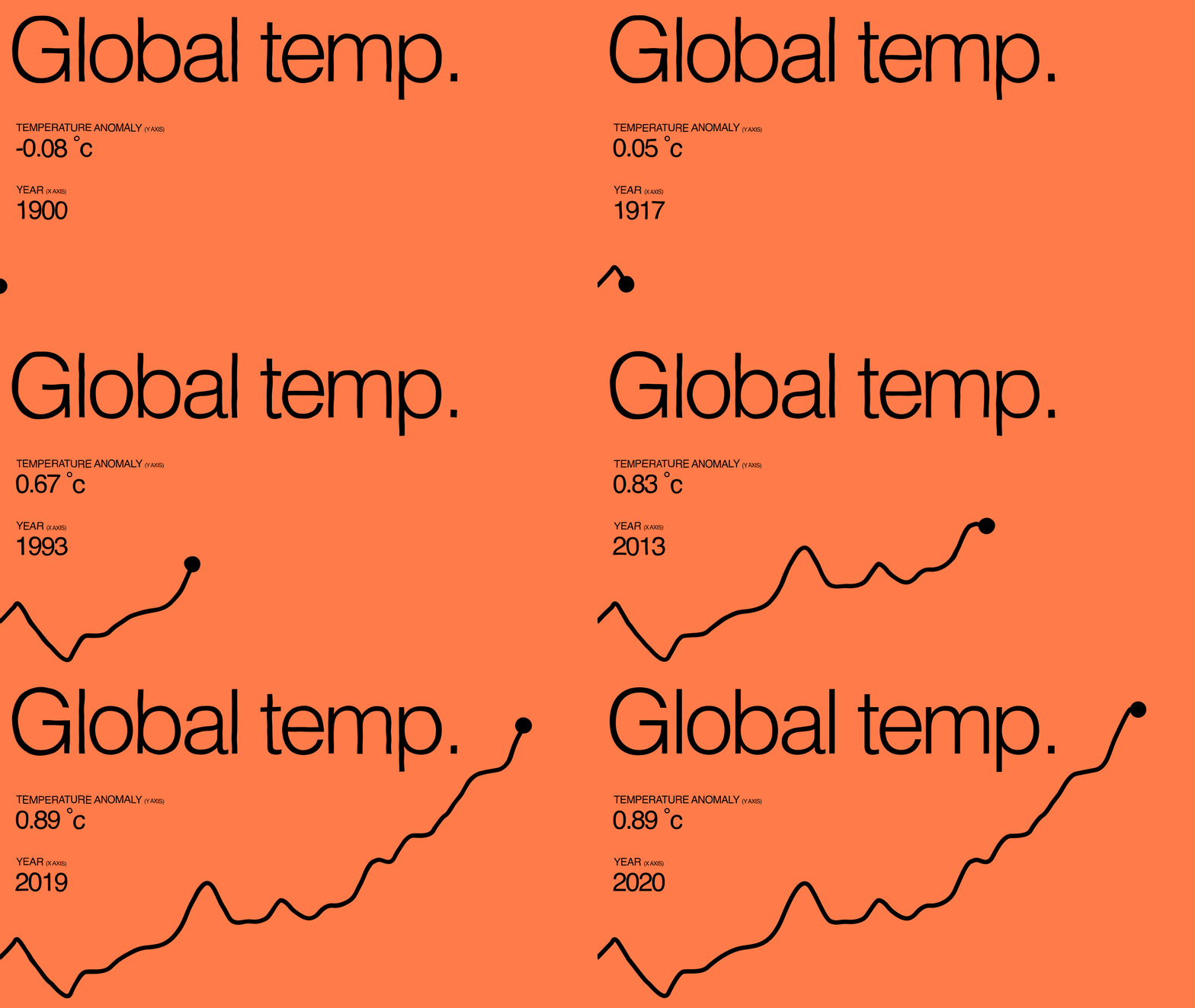
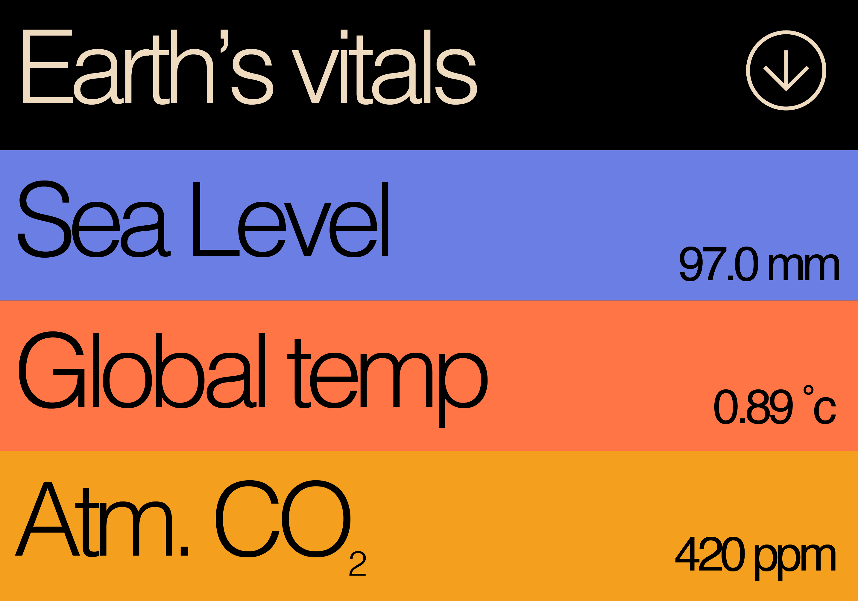
In this data visualization project, I aimed to present the connection between climate change, economic inequality, and related data in a format that was easily digestible. To achieve this, I created an animated explainer video with a voiceover that narrated a compelling story while presenting relevant data. The video comprised a series of smaller animations and data visualizations that worked together to build the narrative.
Through this project, I effectively condensed complex ideas into visuals to guide viewers through a clear narrative. This storytelling approach proved to be much more engaging than simply presenting data without context. A significant amount of time was dedicated to structuring the presentation, as the order of information was crucial for effectively telling the story of extreme carbon inequality. By analyzing the structure of data visualizations, I was able to understand how to effectively animate them and integrate them into the broader narrative.
YouTue video: https://youtu.be/fMoPdFAI8H8
Website: https://readymag.website/u3299262686/4252015/
#Digital #Website


