
Zihan Gu
Fragment
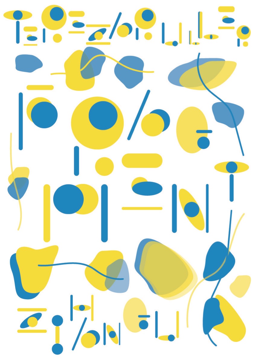
This poster is called FRAGMENT. The designer I choose is Tereza Ruller, a young Dutch designer. Her design works always have a sense of quirkiness and fragmentation. Her design concept is to make the audience think or interact when they see the works. At first, I wanted to make bloated fonts in the designer’s style, but in the process of exploring, I realized that this idea was just a formality, not a real concept. So I gave up all the previous schemes and chose new points: eyeballs, irregular shapes and lines, repetition... I noticed eyeballs always appearing in Tereza’s work, so I took the shape of the eyeball as the prototype and used vector graphics to represent the eyeball. At the same time, around the font I choose to make irregular graphics, repeated design, these graphics around the direction of the debris in the middle of the show, when people see this poster, they have to find its name just like playing a game, and the irregular repeat graphics will help them to find the answer. The designer‘s name is on the top of the poster, and my name is on the bottom.
I have incorporated our name into the poster as part of the design. Through special printing, the layer-by-layer plane graphics will present a new colour, and we can also see the change of light and shade, which is an invisible interaction that creates a subtle relationship between the plane graphics and the paper.
Why the name is FRAGMENT? First of all, it’s experimental typography, and the typography I’ve designed shows a sense of fragmentation, where they’ve split apart but theyre part of each other. The second reason is that the designer’s works also present a large number of unconscious fragments. Disordered and freely scattered is Tereza’s style of poster design. I divide these scattered expressions into fragments, which can be fragments of thought, soul, art or human beings.
#Poster